
Tuesday, December 14, 2010
Thursday, December 9, 2010


Tuesday, November 16, 2010


Friday, November 12, 2010
Logo 4
 The logo is made up from a car design and colored text. I tried to make this logo as simple as possible so it would not be that overwhelming. For example, the text is perfectly balanced in the center of the car shape so it seems as if the text is blended into the car shape making the whole logo look as one. Also, the text and the shape contrast each other by the difference of colors between red and black creating a perfect harmony within the logo making the logo stand out. Furthermore, the logo is so simple that it could blend in or fit, in any kind of background, business card, etc. because of the simplicity of the logo which makes it possible for the logo to shrunken or broaden for whatever the case may be. In addition the logo also has a vertical symmetrical line which goes through the middle of the logo. In conclusion the goal for this logo was to create a logo of a car company but came out looking as a car care business. Finally, coming up with this outcome and ended up liking it better then my first idea.


Logo 3
 In this project I tried to design a logo for a car company which came out to be harder than I thought since most of the ideas that came to my head were logos of other car companies that I already knew. Therefore, I started with my own custom outer shape which I made with the pen tool and tried to make it look like a heart by making a very sharp point at the bottom and at the top I created three curves uniting the top together. Furthermore, I also created a background of repetitive shapes that look like an “s” in order to incorporate the first letter of my name in the logo. In addition, the text on the top which is my last name (and got the idea from official car logos since most of them are named after a person and is normally their last name) well I decided to give the name of Hernandez to the car company therefore, incorporating it in the logo. I also gave it a background of arrows making the allusion of a race track to make the logo even more complex. However, the arrows also serve for another purpose since I have mentioned before that it gives the allusion to a race track and what happens in a race track well races meaning that the cars are sport cars not any kind of car but a race car. Finally, the shape of the bull gives the allusion of the power the car has to output while the red color gives it its mean and powerful raging engine. In conclusion it all comes together in unity for the creation of a great looking logo.


Logo 2
 In this project I learned how to incorporate shapes, color and text together in order to create a simple logo but at the same time complex. This is basically the definition of a perfectly good looking logo in the world. For example, the part of the text that states “Hernandez” is colored in a peculiar way that makes it look simple yet it is not since there is a transition of colors from the first “n” to the end. Furthermore, the text that is in the bottom part of the logo is the most complex part from the logo because it involves a shadow and a transition from red to grey colors throughout the text since it begins until it ends. The intention of this was to create an allusion of the speed of a race car during a race while also blending in with the arrows of the logo simulating a race track. In conclusion I think that this was one of the best logos I did since it illustrates the perfect definition of a logo “simple but complex at the same time.”


Friday, November 5, 2010
Logo 1

--In this project I learned how to create logos by using shapes, a focal point, color contrast and balance to create unity within the logo. For example, the “r” in engineering is directly in the focal point to create a balance with the horizontal and vertical lines of symmetry and also to create unity within the logo. Furthermore, the shape of the gear ring gives the allusion to engineering since it represents the mechanics and science involved in engineering. Also, the text is curved to the point in where it passes directly in the middle of the logo in order to create a perfect balance. 


Friday, September 24, 2010
Thursday, September 23, 2010
Montage Project

In this project I learned how to manipulate pictures in order to create a montage. I chose this montage since I think it was the best creation I did. This montage took me about two hours to create since I was not that comfortable with the way it looked so I had to keep moving things around and adding other things until it came out which is this my final draft. Also the blending options helped me a lot to get the effect I wanted, however, in some cases it was not a good thing to do since it ruined the way it should look. Overall, I think that the final draft came out looking good since I had practiced with two other montages. In conclusion, what I learned from this project was to create a photo montage and manipulate photos to make the montage look good and finally how to blend the pictures together to make it look as one picture overall.


Thursday, September 2, 2010
Tutorial 75
LOADING
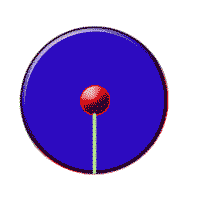
In this tutorial I learned how to design a loading logo which was time consuming and quite difficult since there was many steps to do. The animation part was the most difficult and time consuming since I had to copy the loading layer about forty times in order to get the animation to run smoothly. Also, arranging the loading layers inside the circle and getting them into the exact timing until it would look as if it was moving already in a static picture was the most time consuming part. I hope that over time I could do it faster or if there was a shortcut I would like to know it so I do not waste too much time in an animation project. Overall, I think that for my first time I did a great job in this project since I had no clue on how to start it. Finally, this was an interesting tutorial to work on and a good skill to develop.
Tuesday, August 31, 2010
Tutorial 1

This tutorial was a little harder than I thought because you have to be really precise with the mouse in order for the eyes and mouth to come out right. However, since I was spending to much time I decided to take a different approach to it. I decided to make the face look silly and even titled it the Wal-Mart silly face since it looks like if it just got out of bed. Although it did not came out as the one in the tutorial I actually like the end result even better that the one in the tutorial because it would be just coping the same face therefore, making mine more unique than the tutorial’s and any other designed face in the internet.
Tutorial 6

In this tutorial I learned how to put a picture in text which came out looking good. I also, tried to make it unique by putting the world as a background and the text saying that it is my world. This technique is really good to know since sometimes you might want to take part of a picture and embedded into a text to make it look neat and awesome which many people admire it when it is such an easy thing to do. Well first you get the transparent text tool which only outlines the text that you are writing without showing anything inside of it. Finally you just get a picture that you want to put as text and put it as a background layer, then just put the text on top and copy the image into the text and it is done. It is just that simple to do and it only takes about five minutes.
Friday, August 27, 2010
Tutorial 4
BEFORE

AFTER 

Making a CD is not that hard in fact is easier than I thought because the only the things you have to do is to make a circle around the image and a circle in the center of the image. Secondly, just put some effects to the picture like shadows to make it look more real and you are done. Is that simple to do and you can have fun experimenting with other pictures as well like a family picture that could be made as a CD in order to print a DVD with the picture that shows like a family vacation etc. Overall, the easiest and simplest tutorial to make and once in a while may be useful.
Tutorial 7

I found this tutorial very interesting since I like to draw but sometimes when drawing a picture you cannot see the lines that clear from a photograph so this tutorial actually makes it easier to see the lines making it easier to draw. Furthermore, it is not that hard to do since the steps are in the tutorial and the only thing to worry is to follow the tutorial step by step. This of course, might a good skill to know since some things look better in a pencil sketch than in a photograph at least that is my opinion. Overall I had fun with the tutorial since it was not that hard and it does not take more than five minutes to do.
Tutorial 79
BEFORE 
AFTER
In this tutorial I learned how to change faces and after learning the skill of how to change things around with the lasso tool on Photoshop I managed to add something unique to this picture which was the swastika and the carrot to make it look more unique and more as Bugs Bunny instead of just changing the head. I might use this skill very often in the future since it is important to know how to put things into pictures and/or taking out of other pictures. Furthermore, it is a little hard to get used to the lasso tool since you can make a mistake so easily and have to start selecting everything all over again. This was the major problem that I faced while doing this tutorial.
Thursday, August 26, 2010
Tutorial 44

In my opinion, this tutorial was one of the easiest since there were not many steps to follow and easy as well. However, this effect of a rainy day is important because it could be useful for other projects in the future. Furthermore, it the rainy day creates a nice effect on the picture since it seems that it is an actual picture that it may had been taken by a professional photographer. I actually had fun in applying this effect in many pictures even with people and it still looks good. This effect is something that can come in handy when trying to do a project that involves something to do with a rainy day.
Tuesday, August 17, 2010


Tuesday, July 27, 2010
My First Impressions
I expect this class to be fun and challenging in order to expand my creativity in th art world. Furthermore, I would like to learn how to use adobe photoshop better and faster to not waste too much time trying to find how to do something. Therefore, I could spend more time thinking about ideas on how to improve my designs so I could excel in this class without a problem. Finally, I would like to learn how to create awesome designs in order to find job opportunities in the art industry. In my opnion I took this class because of some of the rewarding careers you may find if you know how to use software like adobe photoshop to create designs.
Subscribe to:
Comments (Atom)